Rocks Drinks
Brand Identity
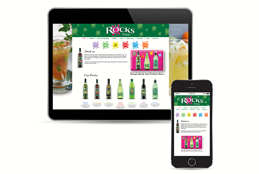
Website
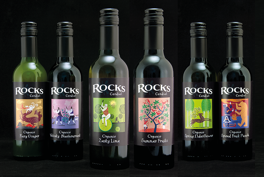
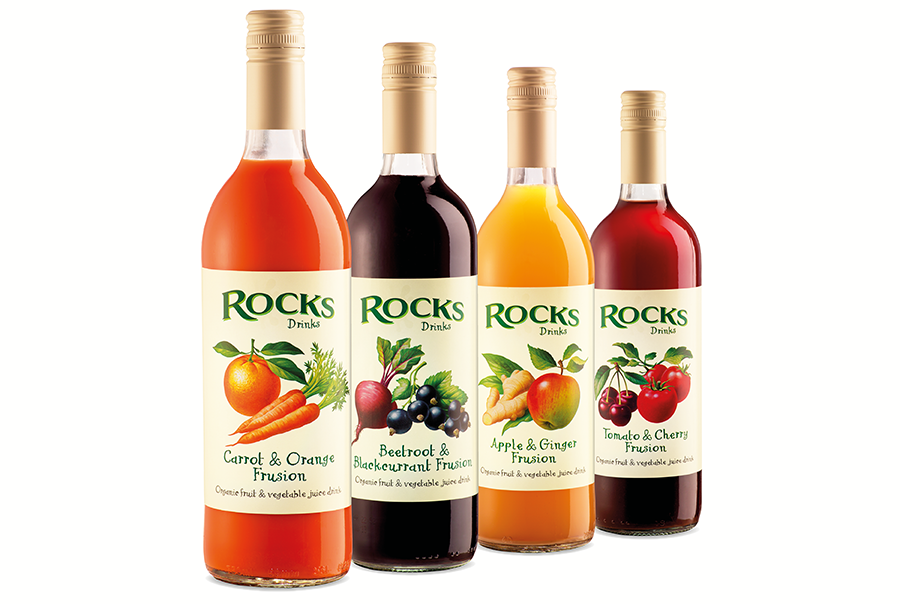
Label Design
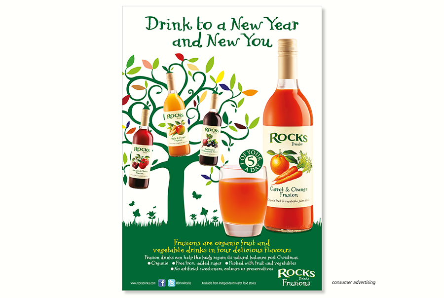
Trade Advertising
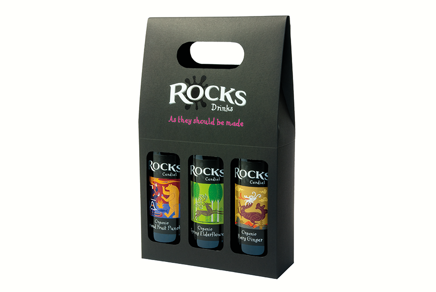
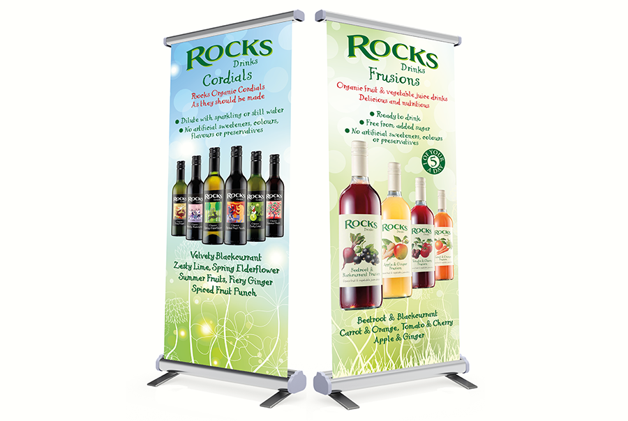
Sales Collateral
Briefly
Rocks drinks are distinctly different to run-of-the-mill squashes and cordials. They contain only 3 simple ingredients – whole fruit (the more the better), sugar and water. Nothing else.
For many years they looked different as well, but not reflecting the high quality of the product: low-key branding, supported by quirky and naïve illustrations severely restricted its ability to appeal to consumers beyond its core market in the health food sector.
Taking on pmdc’s recommendations, Rocks agreed to reinvigorate both branding and packaging.
What we did
We gave the brand a visual focus through a unique, hand-drawn letterform, combining it with a restrained, yet playful splash to retain attraction for younger consumers. Together, they create an impactful and adaptable brand statement that immediately defines and differentiates Rocks products.
Through intelligent use of colour, the splash provides additional product differentiation where required.
What happened next
Our redesign provided opportunities for the brand to engage with adult consumers with more sophisticated tastes, prompting the launch of new fruit and vegetable-based ranges.
The wider appeal provided by the new design strengthened the brand’s position in the health food sector and resulted in expanded and new retail listings in Morrisons, Tesco, Sainsburys and Waitrose.
